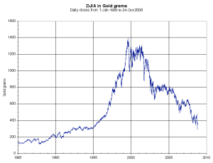
This stock market collapse started in 1999 October 31, 2008
Posted by Jeff Nabers in Money, Precious Metals, Self Directed IRA/401k.Tags: 401k, dollar, dow jones, economics, economy, gold, index, indices, inflation, ira, market, Money, price, s&p 500, self directed, solo, Solo 401k, stock
trackback
The following charts should look familiar to you:
These charts (above) show you the historical account of pricing for the Dow Jones Industrial Average and the Standard & Poor 500 stock indexes. The following chart (below) is also a historical account of pricing for the Dow Jones Industrial Average. It, on the other hand, shows an entirely different story…
The difference between the two DJIA charts? The latter is priced in gold grams rather than U.S. dollars. Gold has been used by humans as money since the beginning of time, wheras dollars are just worthless pieces of paper. As priced in gold, oil prices, median home prices, and just about every other major asset follows an understandable logic. This is because no matter how many times our population deviates from reality, it is always forced to come back to it. The position of that reality is seen in charts published by www.pricedingold.com.
If you previously weren’t keen to this basic economic understanding, it changes everything.
![]() Subscribe
Subscribe
 del.icio.us ::
  Digg this ::
  Stumble it ::
  reddit ::
  facebook


Comments»
No comments yet — be the first.